Making mistakes is part of human nature. After mistakes are made, you figure out what you did wrong and adjust yourself so you don’t repeat the mistake in the future. Am I right?
When it comes to online blogging, we have made the mistakes for you so you don’t have to. With the information provided bellow, you can go straight to making those much needed adjustments that will create a much better reader experience.
Too Much Going On

Clutter and chaos on the blog is something you want to avoid. Various widgets you thought help generate viewers may when in fact crowd the screen and drives attention away from whats important – the content of your blog.
Now some people choose to incorporate ads as a potential source of revenue, and that’s ok. Just make sure it doesn’t overwhelm the visual field of the blog and they aren’t intrusive. Some ads are a nightmare. They can block text, make unnecessary noise, scroll along with the rest of the content, etc. It can cause organizational issues and push your readers away.
Pop-ups
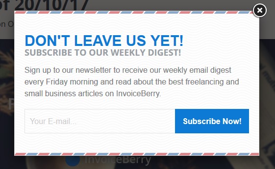
Along with aforementioned clutter, pop-ups if not implemented right, can negatively affect your viewership.
Now pop-ups are hit or miss with some of the audience. They can become a nuisance if they are constantly bombarding the reader whenever they do something on your blog. The key here is knowing what pop-up is effective and how to make them easy to circumvent if the user chooses to.
If you want to implement pop-ups on your blog, think about what would their purpose be. Just make sure it’s not another advertisement.

Use pop-up as a way to inspire the reader to take action within your blog. Perhaps sign up for a newsletter or subscribe to your notifications.
Don’t be annoying. There should be a balance of persistence and functionality.
Difficult Navigation
We all get a little frustrated when we have to drive in circles to find a new location we’re not familiar with. GPS may say “you have arrived at your destination, on your right” but it obviously isn’t it. Goal here is to avoid having users jump through hoops and ‘circle around the block’ to find what they are looking for.
Navigation should be intuitive for both new and old users. A simple single line menu should offer plenty of space to fit in the required navigation options. If you have a lot going on, consider implementing a drop down menu where each subsequent link matches the idea of the text you hover over.

Stick to the same theme through out the blog. This will help your reader understand what the contents of the blog are and you won’t have to create a complicated method to categorize your haphazard thoughts.
Overly Complicated Language
The blog you’re creating needs to appeal to a large audience. After all, you are on the internet, with over 3.5 billion users. Most readers out there want content that is easy to read and understand. Not only is this good for your audience, using simple language is better for your SEO efforts.
Missing Search Bar
After you have accumulated a sizeable amount of content on your blog, a search bar becomes one of the most useful tools. It allows the user to reach exactly what they need, right away.
The whole goal is to make all your content easily accessible. If you don’t already have a search bar, you should really consider putting one in. Best place to insert a search bar would be somewhere at the top of the page near the navigation bar.
Dead Links
Relevant links that support your arguments or offer credibility to what you’re saying is essential for any worthwhile blog. Having relevant links within the text also helps with your search engine optimization (SEO).
Now to continue bringing in the audience you want, you need to keep creating useful and engaging content for your blog. Of course you should continue to spice up your text with great links that your user find useful.
As you keep producing more and more content, the older links within your previous posts may become outdated. They will start leading your users to empty pages or websites that are no longer functioning. You need to dedicate some time every once in a while to weed out some of those dead links. Trust me, it’s worth the effort.
Here are some possible tools you may want to use to make your life just a little bit easier –
- WordPress plugin Broken Link Checker
- Screaming Frog. Desktop app that scans any URL for dead links you input.
- Link Checker. More technical option. May offer more tools than you know what to do with.
Impossible to Scan

Nothing turns a blog reader off more than just a wall of text with nothing between. People typically go for books when they are looking to immerse themselves into long text. Blogs are here to provide people with content that’s easy to digest – user should be able to glance at the post and get the big picture.
When writing a blog post, think about the ways you can make the post that much more easy to comprehend.
Break up your text into smaller paragraphs.
- Consider using bullet points.
Implement some visual aid such as an infographic that highlights the information within the text.
Cannot Share the Content
This faux pas is not so much for the user benefit but yours. Most readers out there who come across your content and find it interesting may want to share it with their peers. Oh but wait. You forgot to add the option to do so.
You are shooting yourself in the foot here, if the buttons that allow the audience to share the content are missing. Think about the additional traffic you can get just through your audience spreading the word themselves on their social media.
Auto-playing Music or Video
This is a big “no no”. Nothing is worse than browsing through someones blog when all of a sudden your ears are being bombarded by some sounds you weren’t expecting. I am sure this has happened to some of you – perhaps even on a bus or a subway. You scroll and scroll to try and locate the source of this atrocious sound. It so happens to be on the very bottom of the page.
Avoid doing this at all costs. For me personally, if this ever happens while I browse any site or a blog, I just exit off the page and never return. Many more users do the same.
Auto-playing anything at all on your blog will just push away your audience. You have to realize that for many, this can be a very shocking surprise and you never know what the volume settings are on the users device.
Mobile Friendly

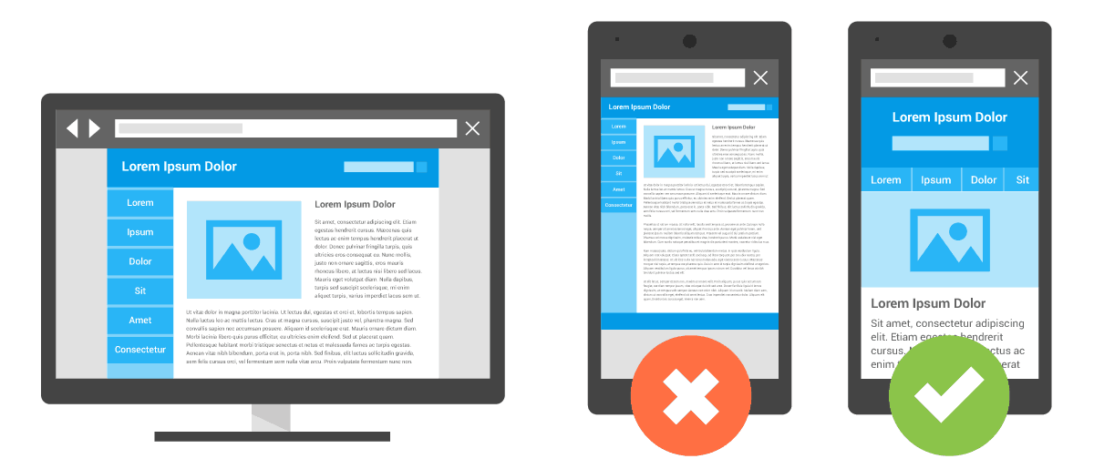
More and more users are accessing the internet on their mobile devices. In fact more users are using their phones and tablets to browse the internet than their laptops or desktop computers.
Now some blog hosting sites do automatically optimize your page to fit mobile devices, but you can never be sure. Always be aware of how your blog is formatted and how it functions on a mobile device.
SEO also highly depends on your content being mobile friendly. If someone uses Google to search for something on their phone, only the mobile sites will appear at the top of the list. If you are not one of them, you’re missing out on a lot of valuable traffic.
What Did We Learn?
As you can already see, we covered some of the most basic and also most repeated blogging mistakes around. There is no need to keep repeating these mistakes. However small some mistakes may be, it only drives a wedge between you and your audience.
Make a check list, and go through your content and see if you can find any issues that we covered in this post. You may have missed a few faux pas. Never hurts to double check your blog and correct anything you have overlooked. This will greatly improve user experience and create a better rapport between you and the reader.


